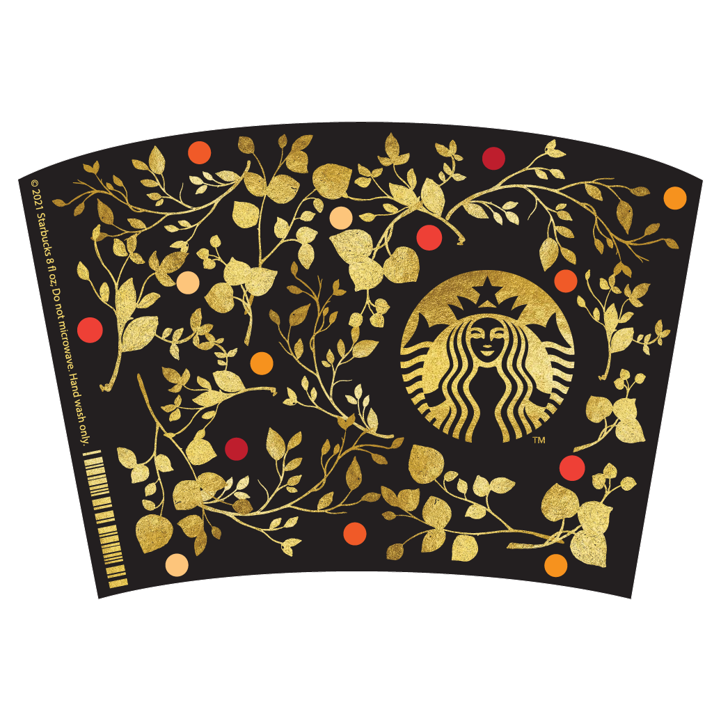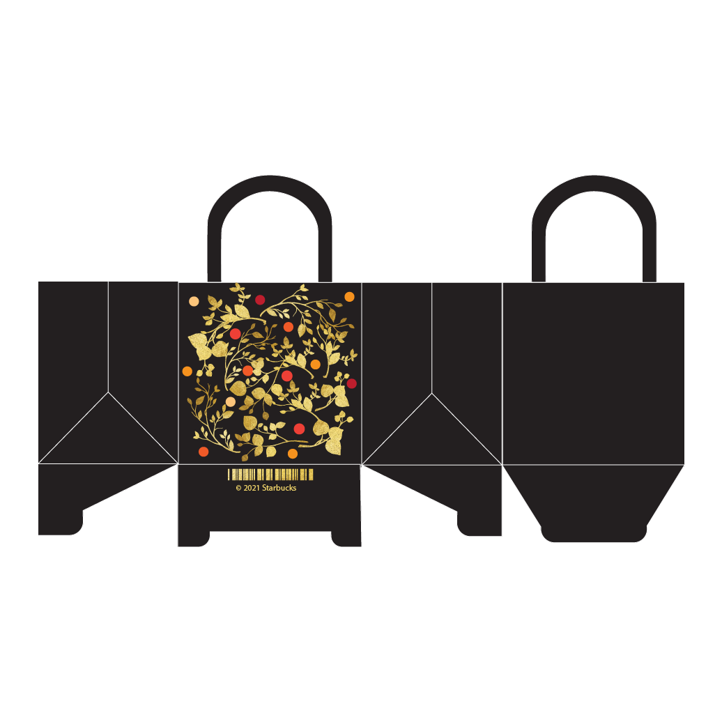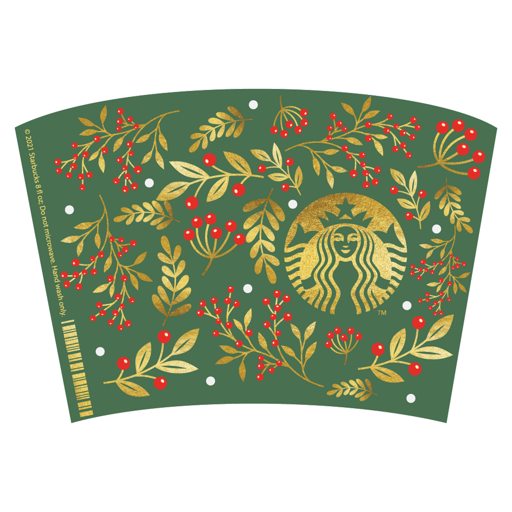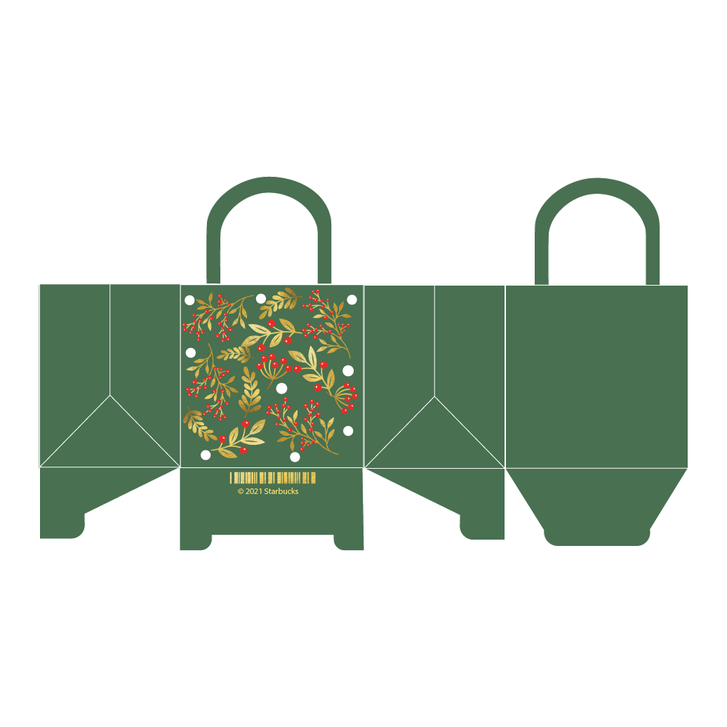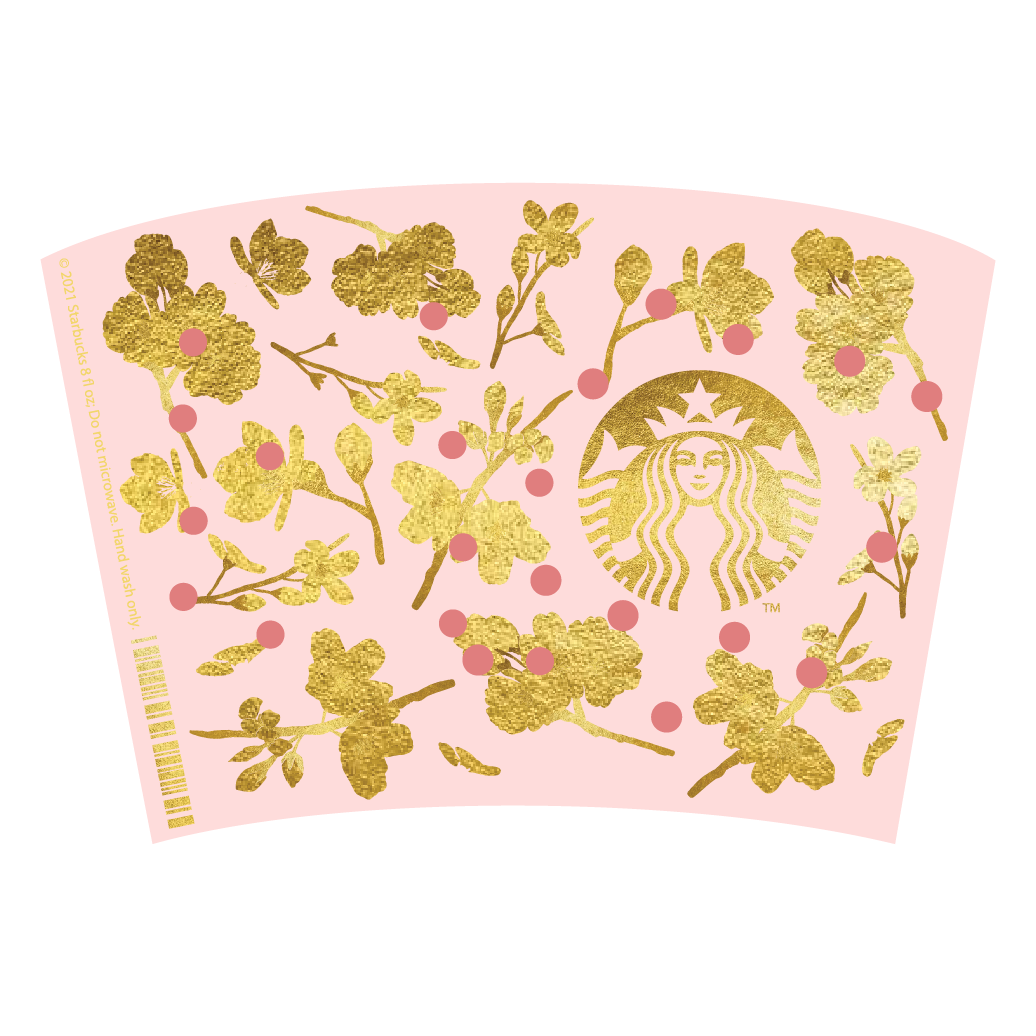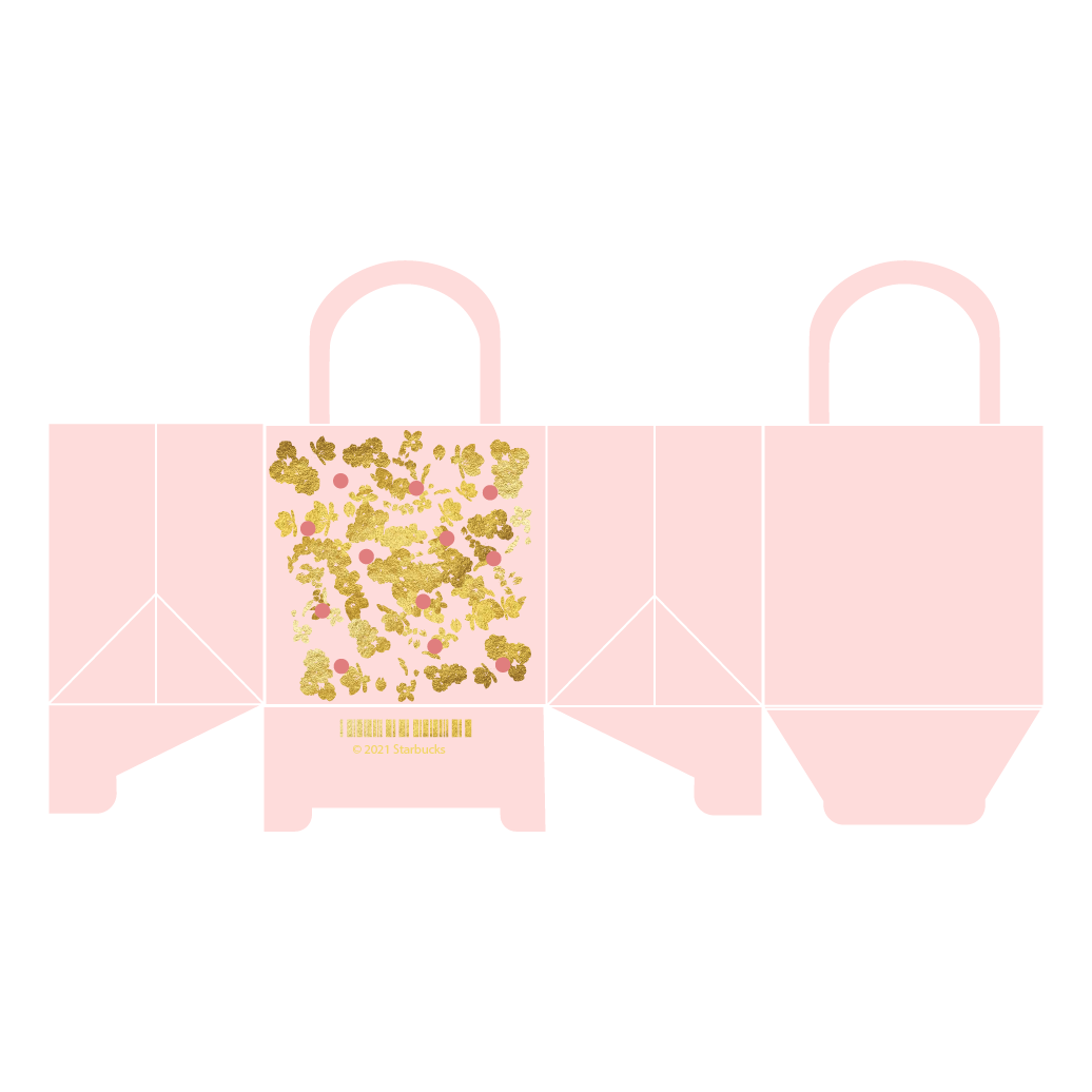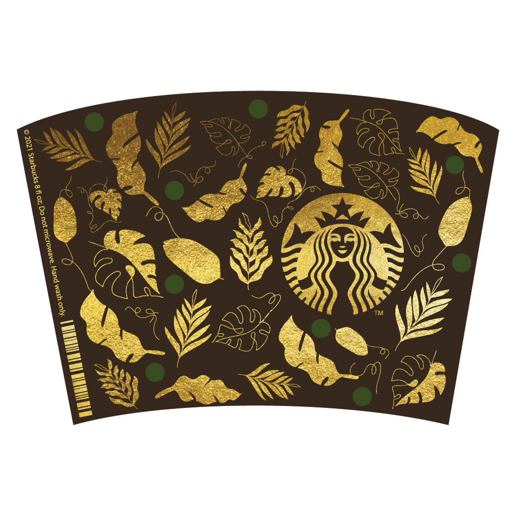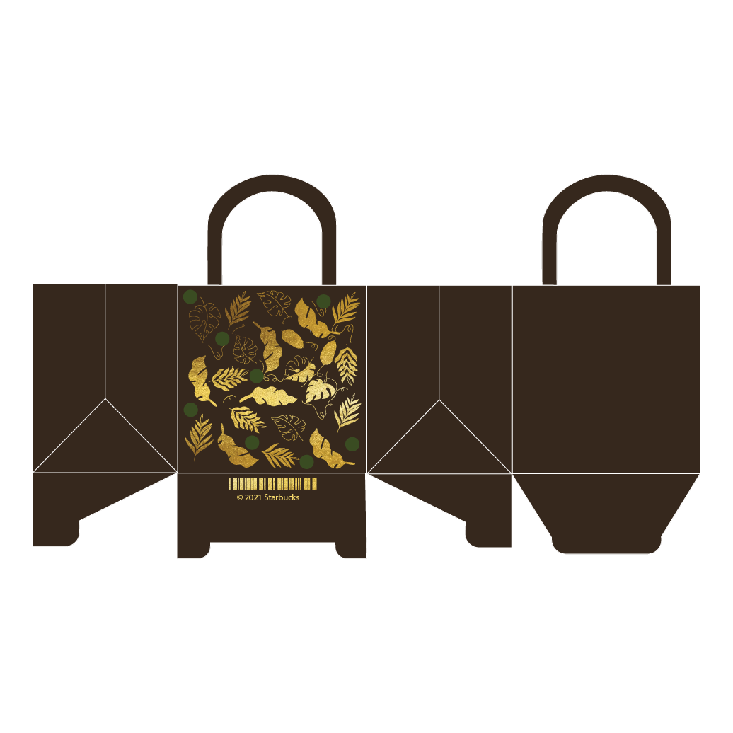


In this Case Study, the client asked for the development of a packaging campaign for Starbucks in the US. Surveys were conducted to determine consumer preferences for packaging. The survey included 25 college students from Florida Gulf Coast University, between the ages of 18-25. Of the 25 students, 16 were women and 9 were men. After the survey was conducted, the data concluded that the target audience was more inclined to visit Starbucks when seasonal or special occasion packaging was implemented. Based on the survey results, Packaging was developed for each season utilizing Cricut Design studio to make the physical packaging designs accompanied with props and food to develop product photography. This project utilized Adobe Illustrator, Photoshop, and Cricut Design Studio to create the physical product displays.
